Keyword analytics
The Keywords tab of the Analytics dashboard breaks performance down to the keyword level. It is the right view when you need to see which keywords drive installs, which are expensive for little return, and how keywords relate to the search terms users actually typed. Every metric on this tab is defined once in the Metrics glossary.
Before you start
- Apple Ads integration connected.
- MMP integration connected if you want installs and revenue data.
- Admin, Editor, or Viewer role.
What the tab shows
The tab stacks several blocks vertically:
- Overall summary. Totals for the selected date range and filters: Spend, Installs, TTR, CVR, CPI, and ROAS where revenue is available.
- Performance trends. A time-series chart for the selected metric. Drag the brush below the chart to narrow the dashboard's date range to the sub-range you highlighted; all other blocks on the tab re-compute against the new range.
- Change impact. A panel that ranks keywords by how much they contributed to movement in the chosen metric versus the prior period of equal length. Click a row to cross-filter the rest of the tab to that keyword. Click the row again to clear the filter.
- Keyword table. One row per keyword. Columns below.
- Cluster analytics. A summary table grouping keywords by efficiency profile. Covered in its own section below.
- Search term overlap. A separate section showing which search terms each keyword matched and the share of voice on each. Covered below.
Columns on the keyword table
The full set of keyword-level metrics is available as columns; use the column-visibility menu (three-dot icon at the top of the table) to show or hide groups:
- Ad Performance: Impressions, Taps, TTR.
- Conversions: Installs (Tap-Through), CVR.
- Cost Metrics: Spend, CPT, CPI.
- Auction Insights: Average Share of Voice, Average Bid, Total Keywords, Prioritized, Deprioritized. Share of Voice comes from Apple's Impression Share API (30-day maximum lookback).
- Revenue and ROAS: Revenue, Revenue D0 / D1 / D7 / D14 / D30, and the matching ROAS variants, where your MMP supports them.
- Per-event MMP columns: any event configured in your MMP surfaces as
<Event> (Count),<Event> (Revenue),<Event> (ROAS), and<Event> (CPA)columns. These columns reflect the events configured in your MMP, so two customers will see different sets.
Exact-match keywords are displayed in square brackets ([keyword]) so you can tell them apart from broad matches at a glance.
Sorting and filtering
Every column in the keyword table is sortable. Click a header to sort ascending; click again for descending. Sort by CPI ascending to find the most efficient acquisition, by CVR descending to find the keywords that convert best, or by ROAS descending to find the highest return.
Filters in the filter row narrow the tab: App, Market, Ad placement, Catchbase status (all, enabled, disabled), Campaigns, Ad Groups, and Keywords. Selecting upstream filters (for example, App or Campaigns) prunes the keyword list to those still relevant. The filter state in the row is the same one the Overall, Trends, and table sections read, so the three views stay consistent.
Cluster analytics
The bidding model clusters keywords by efficiency and behaviour, from "Very High" performers down to "No Cluster" (not enough data yet). The summary table shows per-cluster totals (keyword count, spend, CPI, CVR, ROAS) and updates with the dashboard filters.
Use it to read the shape of your portfolio at a glance: whether spend is concentrated in the top clusters, whether a long tail of low-cluster keywords is dragging CPI up, or whether a previously strong cluster is drifting.
Search terms as a companion surface
Keywords are what you bid on. Search terms are what users actually typed. A single keyword (especially a broad match) can match many search terms; a single search term can match several keywords. The Keywords tab surfaces the relationship in two places:
- Inline search-term popover on the keyword table. Hover or click the search-term cell on a keyword row to expand the top matching search terms with Share of Voice shown per term. The popover shows the first two inline; click to expand to the full list for that keyword.
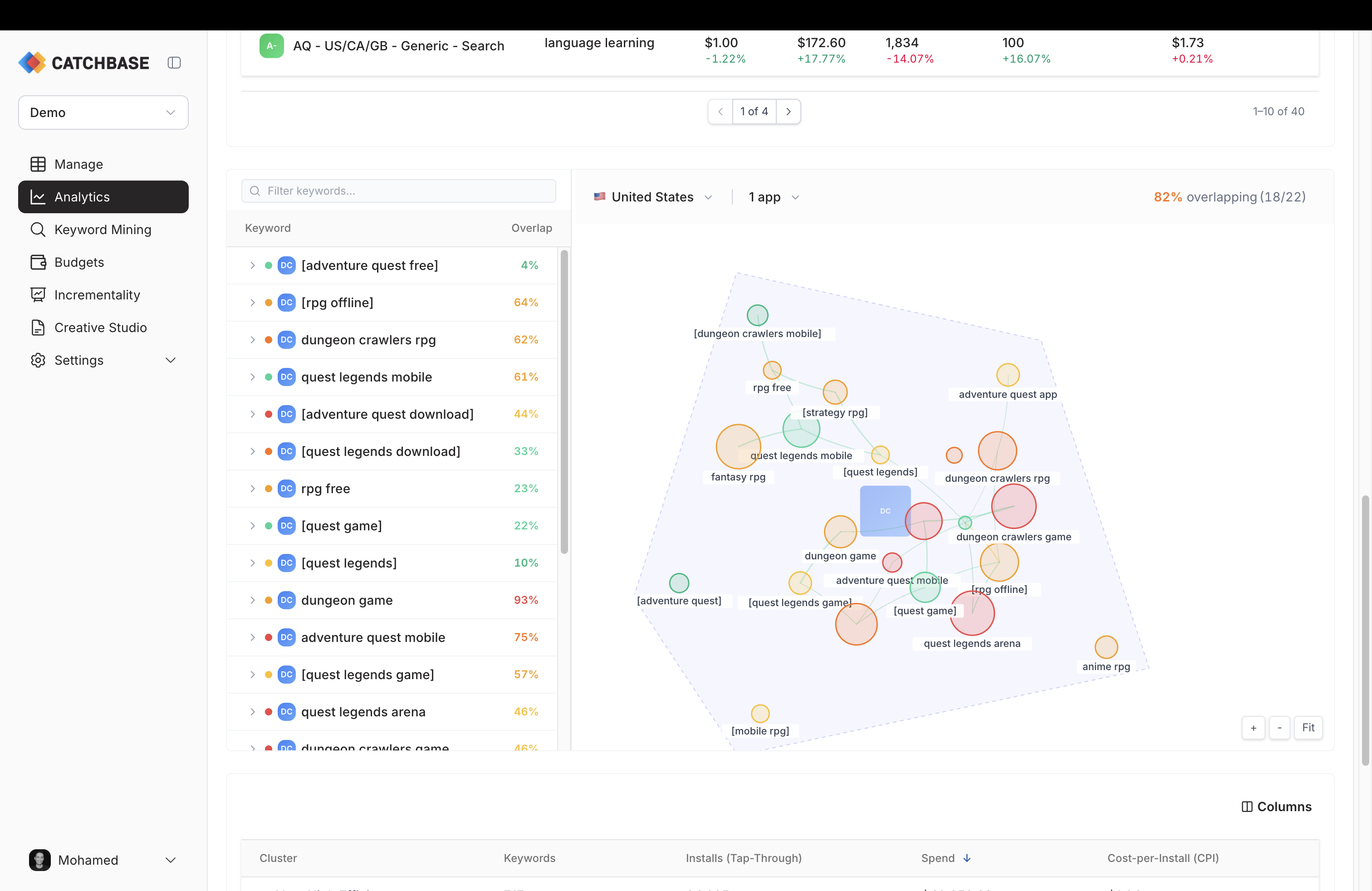
- Keyword Overlap network graph. A force-directed graph below the table that renders keywords and search terms as nodes and shared search traffic as edges. Pan and zoom the canvas. Node size reflects how many search terms a keyword captured; edge thickness reflects the overlap. Use it to spot two ad groups bidding on the same search term through different keywords.
A fourth tab, Search Terms, shows the same picture from the search-term side: one row per search term, with which keywords it matched and their overlap.
When a keyword underperforms, open the search-term view to see which queries it picked up. You will often find the keyword matched on off-topic searches worth adding as negative keywords on the ad group.
Notes
Revenue and ROAS are attributed by install date and spend is attributed by ad-event date. Cohorted revenue and ROAS (D7, D14, D30) trim the most recent N days of installs from analysis. See Data freshness for how to read those windows.